 In an effort to improve my coding skills, I’ve been working on a little php/mysql shared shopping list webapp for my wife and I to use. Today I finished moving the UI into the Bootstrap framework. Bootstrap is a side project by some of the developers at Twitter, who had the goal of making attractive UI elements that conform to the ideals of response design.
A responsively designed site will conform to the screen size of whatever device views it. Desktop, phones, or something else in between. As someone who maintains a mobile site at work that’s entirely separate from our desktop site, the idea of integrating the two was pretty appealing. No separate code bases to maintain!
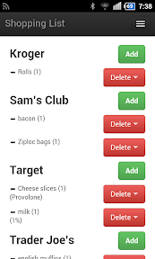
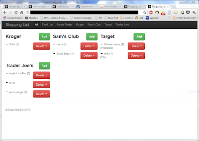
I’m happy to report that Bootstrap makes the process of developing a responsive site dead simple and, dare I say it, even fun. Above is what the shopping list looks like on my phone. Here’s what it looks like on the desktop. Remember, that’s the same html file on both devices:
 |
| From Shopping List project |
Responsive design probably doesn’t fit the goals of every site out there, but it’s a design philosophy I find intriguing. If you’re at all interested in responsive design, give Bootstrap a look.