
By asking simple demographic questions, user research can provide deep insight into the different ways different kinds of people use our sites & products. This is my favorite example of how visualizing this data can have an impact on stakeholders:
We were conducting a first-click test using Optimal Workshop’s Chalkmark tool. Participants are shown a screenshot, given a task, and asked to click where they’d click first to try and accomplish that task. Chalkmark makes it easy to visualize this data as heatmaps. When paired with demographic survey questions, it becomes possible to filter those heatmaps by user types. The results can be striking.
We asked users where they’d click first to find a book.
All responses
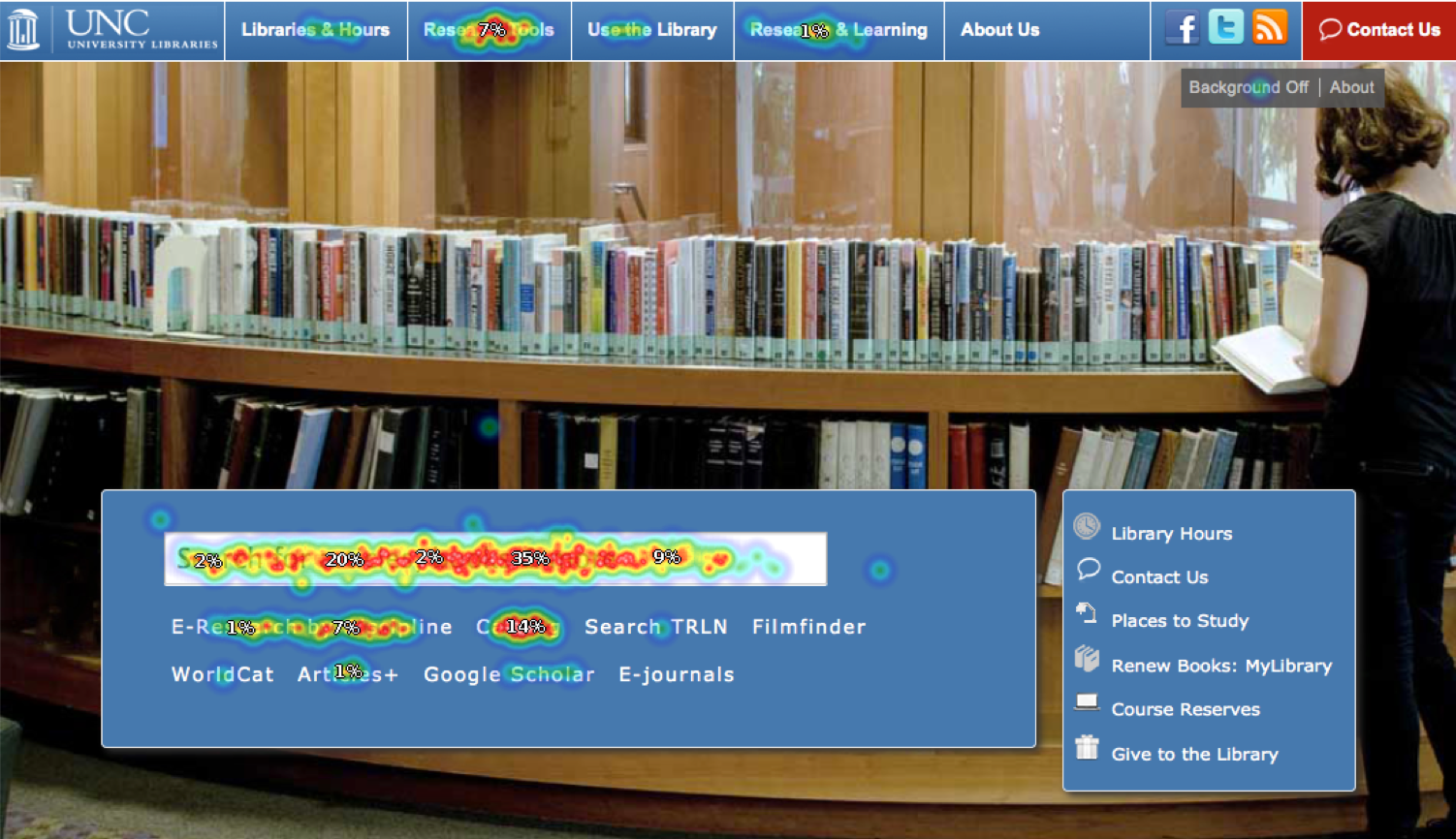
About 70% used the main search box, and 15% clicked on the link to the Catalog.
Responses only from Libraries’ staff
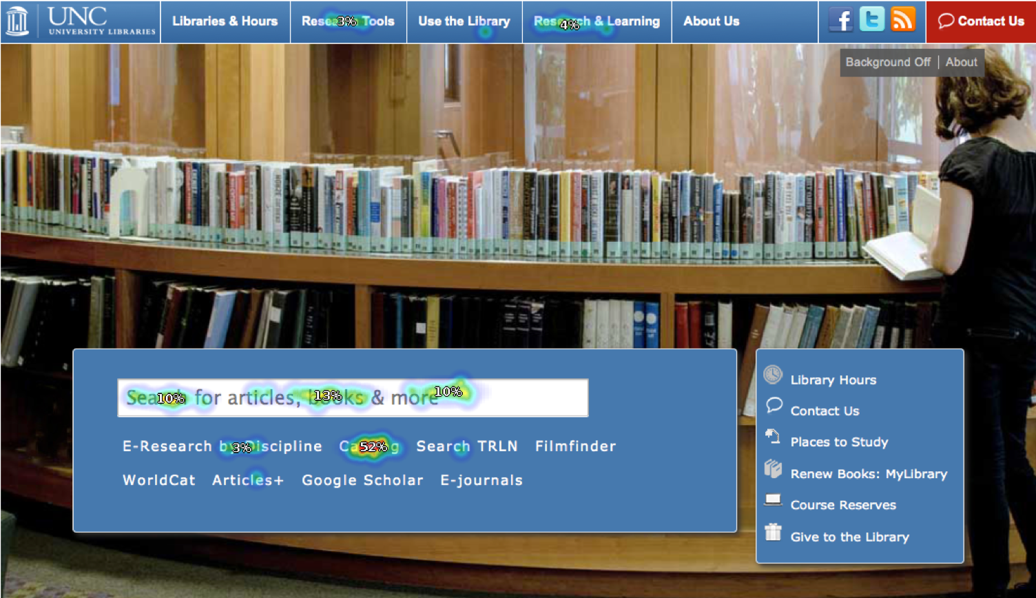
52% went to the Catalog link, and only 33% used the search box.
This was one of the first visual examples we had that we are not our users. It was a powerful tool to show stakeholders and establish the need for further research into the design of our tools & services. Put simply, we are not our users. We behave differently than them, and can’t make design decisions based on our assumptions or the way we work. This one survey convinced the organization that we needed a dedicated UX Research team.