
![]() Usability testing is one of the best parts of my job. I love hearing from users about how they interact with the library’s website and then figuring out what we can change to better meet their needs.
Usability testing is one of the best parts of my job. I love hearing from users about how they interact with the library’s website and then figuring out what we can change to better meet their needs.
The dark side of this testing is the sheer time involved. Recruiting, scheduling, and sitting down with each individual user can be a daunting commitment of staff hours. I’ll say upfront: that type of testing is still great! It definitely has a place. But we’ve started using a tool that lets us run more tests, more often: Optimal Workshop.
One important bit: While Optimal Workshop has a free plan, you’ll get the most out of it if you spring for the paid level. It’s on the pricey side, but keep in mind that they offer a 50% discount to educational customers.
What we did
We used two of the suite’s three tools in a study earlier this year: Chalkmark and Optimal Sort. We advertised the tests with a pop-up on our homepage that was displayed to half our visitors. All respondents were able to enter a drawing for a $50 Amazon gift card at the end. We expected to run the tests for at least two weeks to get enough responses. But after just a week we had more than 500 and were able to conclude it early. That number exceeded my wildest expectations! Here’s how we used each tool:
Chalkmark
Think of Chalkmark as a first-click test. You display a screenshot or design draft to your users, and ask them where they’d click first to accomplish a given task. Results are displayed in a heatmap that’s easy to parse at a glance. For example, we asked users where they’d click first to search for a book on our homepage:
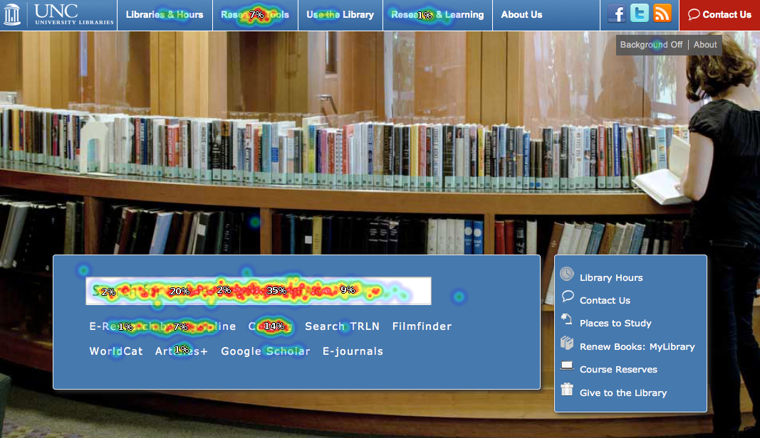
Click for larger view
82% of clicks were either in our main search box or on the link to our catalog. That’s great! They were able to find their way to a book search easily. Another 7% clicked on our Research Tools menu. While that’s not ideal, it’s also not a bad option; they’ll see a page with a link to the catalog next. That leaves about 11% of our users who went astray. Thanks to some demographic questions we asked, we know a little about them and can try to figure out what was confusing or unintuitive to them in future tests. We can also view other heatmaps based on those demographic questions, which is proving useful.
(Side note: We asked library staff to take the same test, and got very different results! Fascinating, but the implications are still unclear and a topic for another time)
Optimal Sort
Analogous to an in-person card sorting exercise, in an Optimal Sort test users are shown a list of text items and asked to sort them into categories. We used it to get at how our menu navigation could or should be organized. Results are shown in a matrix of where each item got sorted:
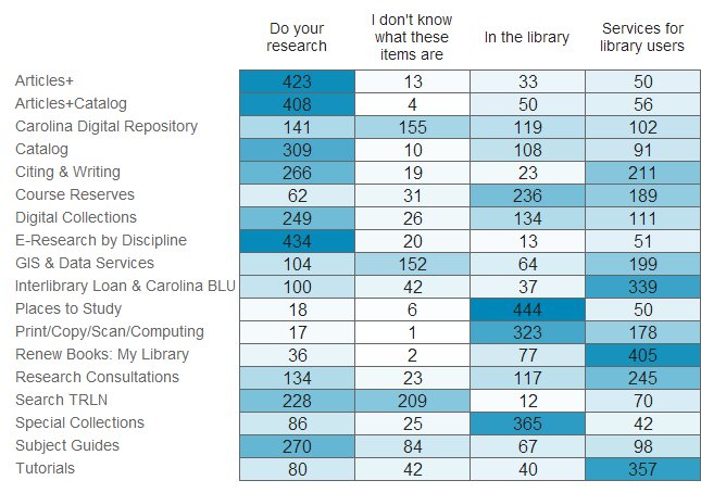
Click for larger view
Our results mostly validated our existing menu organization choices, but along the way we accidentally discovered something interesting!
We provided users with the option to sort items into a category called “I don’t know what these items are”. The original idea was to avoid users sorting an item randomly if they didn’t truly have an idea of where it should go. But a couple of items proved unexpectedly popular in this category, so now we know that some of our naming conventions need to be addressed.
Optimal Workshop’s third tool is Treejack, which is designed to test a site structure. We haven’t used it yet, but I’m looking forward to putting it through it’s paces.
Summing Up
Our website is an iterative project, one that is never truly finished. Optimal Workshop lets us run frequent tests without significant staff time involved in the execution, and to reach more users than we ever could in person. Even the free plan, with it’s 10 response limit, is still useful enough to get actionable data in the right context.
Are any other libraries using it? I’d love to hear what you’re testing.

 Fine print: My opinions and thoughts here are as always my own, and not necessarily those of the UNC Libraries.
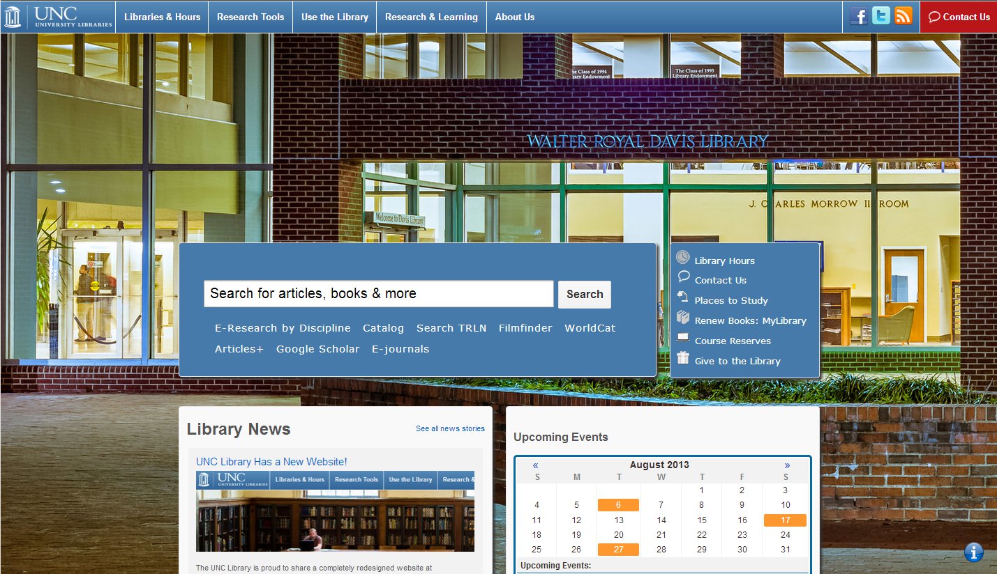